A lot of the brands I'm drawn to are women-led, and I keep seeing the same thing happen to them. A woman-led brand goes looking for a website, and what comes back is pushed into one of a few boxes that don't fit.
This is a big group to get wrong. Women own about 39% of US businesses, 14.5 million of them, bringing in around $3.3 trillion a year. In 2024, women started nearly half of all new businesses in the country, up from under a third five years earlier (Wells Fargo). That's a lot of brands that need a website.
As a woman who came up through tech, I feel this one from the inside. And what these brands actually need is simpler to say than to do: be clear, feel sure of yourself, and sound like an actual person.
The boxes that don't fit
I see three versions of this, and none of them are the brand. They're defaults, dropped onto women-led brands by people who reached for the nearest cliché.
The first is too corporate. Stiff, buttoned-up, a little cold, because somewhere along the way the founder was told this is what serious looks like. So a warm, personal business ends up with a cold, corporate website that isn't her at all.
The second is too cutesy. Soft pastels, dainty script fonts, everything pink and delicate whether the brand is delicate or not. This one has a long history. There's a whole design habit people call shrink it and pink it, taking something built for men and making it smaller and pink to sell it to women. A Harvard piece on it points out that only 19% of product designers are women, which is a big reason so many products aimed at us are just guesswork in a soft color (Harvard). A website can fall into the exact same habit.
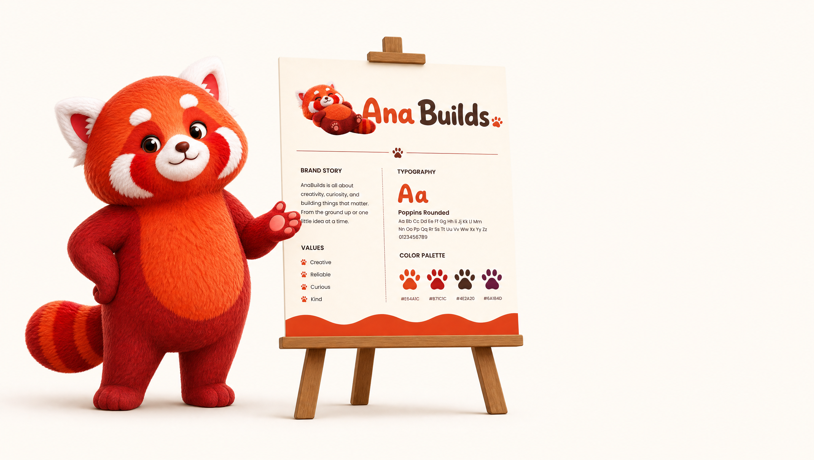
To be clear, I have nothing against pink or soft or playful. My own site is warm and a little cute, red panda and all, because it fits me. The trouble starts when that look gets picked for you by default, because you're a woman, when it has nothing to do with who you are.
The third is the one that bothers me most. The forced empowerment. Every women-led brand suddenly has to be a boss babe, all caps, hustle, you-go-girl energy, even when the woman behind it is quiet and humble and just wants to do good work. I've watched modest, soft-spoken founders get turned into loud empowered bosses on their own websites, because someone decided that's what a woman with a business is supposed to sound like. It shows in the photos too. They get caked in makeup and put in a stiff suit, styled into someone they're not, and you can tell at a glance it isn't them. It rarely sounds like them, it rarely looks like them, and people feel the difference.
None of this is a knock on women who are bold and love a sharp suit. If that's you, brilliant, wear it loud. What I'm talking about is the version that gets forced onto someone it isn't.
Lead with clarity
The part that actually matters here has nothing to do with gender. When someone lands on your site, you have seconds. People form a first impression of a website in about 50 milliseconds (NNGroup), and they'll leave within ten or twenty seconds if they can't tell what they've found. So the first job of any site is to answer three quick questions: what do you do, who is it for, and what should I do next.
Women-led brands get tripped up here more than they should, because so much of the advice they're handed is about looking a certain way or sounding empowered, and clarity gets buried under all of it. A gorgeous, on-trend site that doesn't quickly say what you do still loses the visitor.
Being clear is a form of respect. It says I know you're busy, here's what I do, here's whether it's for you, no decoding required. That does more for trust than any amount of polish.
Confidence without the volume
This one is closest to me. I came into websites from programming, I used to work in game programming, and I've had my share of being underestimated in tech, quietly assumed to be less technical than I am. So I understand the pull to overcompensate, to make everything loud and certain so nobody doubts you.
But real confidence on a website is calm. It's a site that says what it does plainly and doesn't oversell. It doesn't pile on exclamation marks or announce how amazing it is, because it doesn't need to. The work is there, and the reader can see it.
That calm is its own signal. A brand that feels sure of itself, without straining, reads as more capable than one that's trying hard to convince you. You can be gentle and still be certain. Those two things were never at odds.
Sound like a person, not a brochure
The fastest way to sound like yourself is to write the way you actually talk, to one person rather than a crowd. There's a real difference between professional and corporate. Professional is clear, warm, and competent. Corporate is stiff and forgettable. You want the first one.
My own site is where I practice this. My homepage says "Websites that make you bounce with joy," and the button says "Work with me," not "Request a consultation." Lower down it reads, "I build websites for the people and causes I genuinely believe in. Mostly animal brands and women-led businesses, the solo founders and small teams I love working together with." That's roughly how I'd say it out loud to you over coffee. First person, warm, and a little playful, because I am.
None of that is by accident. I could have written "contact us for a quote" and "we deliver bespoke digital solutions," and it would have sounded like every other agency and like nobody at all. Sounding like yourself is a choice you make word by word.
The small choices that add up
Sounding like yourself comes from a hundred small choices that agree with each other.
A color palette chosen because it fits the brand and used consistently, instead of defaulting to pink because the founder is a woman. Type with a bit of personality that's still easy to read. Real photos of the real person or product, not stock. Generous spacing so the page feels calm and unhurried. Copy in a steady, human voice from the first line to the last. On their own, each of these is tiny. Together they're the difference between a brand that reads like itself and one that reads like a template.
What it comes down to
What a woman-led brand needs from a website is pretty grounded. Something clear about what it does, calm and sure in how it carries itself, and written like the actual person behind it. That's the whole list.
That's what I aim for in the concept work I do, and what I tried to do for my own site. If your website sounds like you, the right people will feel it. 🐾