I have three Pomeranians: Jacques, Junior, and Joca. A few years ago I was about the most anxious dog owner you could imagine, sitting on the sofa at midnight reading dog-trainer websites, trying to work out who on earth I could trust.
That's the person I design animal brands for now. And I know exactly what that person is looking for, because I was her.
The night I became the anxious owner
Here's the situation I was in. Jacques was six, and he'd been my only dog his whole life. Barky, a little bitey, the center of everything. Then Junior came home, and Jacques was so unhappy about it that he started shutting himself in another room so he wouldn't even have to look at the new puppy. I was terrified he'd hurt him.
So I started calling trainers. Nearly every one suggested the same toolkit: shock collars, yelling, pinching the dog when he got it wrong. None of it sat right with me. Then I found a place called Positive Way Animals, run by a trainer named Octávio. Their website looked a bit dated, I'll be honest. But the information on it was good, and one line stopped me cold: he trains with positive reinforcement. No fear, no pain. I booked him the next day.
Octávio came over, watched Jacques and Junior for a while, and gave me a handful of tips that felt almost too simple to work. A week or two later, the two of them were cautiously playing. Then sleeping curled up together. Now they're inseparable. I later took them to his puppy socialization classes, which is where Jacques finally learned to trust other dogs. I got so deep into it that I trained my third pom, Joca, myself, using everything Octávio taught me, and he's turned out the most balanced of the three. I've read a shelf of dog-behavior books since, and I'm seriously thinking about training dogs myself one day.
I'm telling you all this because it taught me more about designing for animal brands than any course could. So here's what I actually think about now, with the research that happens to back it up.
What a nervous owner is really looking for
When I was reading those trainer websites at night, I was looking for one thing above all: a reason to feel safe handing over my dog. That's what almost everyone booking a trainer, a groomer, or a boarding stay is doing, whether they'd put it that way or not.
The research shows how hard people look. In BrightLocal's 2026 survey, 97% of people read reviews for local businesses, 41% now say they always read them, and nearly half won't even consider a business with fewer than 20 reviews. I did exactly that. I read every review Positive Way Animals had before I let myself hope.
Here's the interesting part, though. Their dated website didn't scare me off, because the substance was there. Good information beats a pretty shell. But I'd have trusted them faster if the site had felt as warm and capable as Octávio turned out to be in person. That's the job I do now: making the website as trustworthy as the person behind it.
Warm without going childish
The easy mistake is to reach for cute. Bright primary colors, a bouncy cartoon font, paw prints on everything. It reads as friendly for about two seconds, and then it reads as amateur, and amateur is the last thing you want when someone is deciding whether to trust you with their dog.
Warmth done well is calmer. Natural, earthy colors instead of loud brights. Type that feels approachable but still solid, not a novelty font. Rounded corners and generous spacing to keep it gentle.
My own site is a fair test of this. It's warm and playful, with a bouncy red panda front and center, and I'd say none of it reads as amateur, because every piece is deliberate. The palette is chosen and used consistently. The panda is a crafted character, not clipart. The type is a real typeface doing a real job. Playful and amateur can look alike for a second. What separates them is care.
One place I'll disagree with the usual advice, though: most of the "color psychology" you read online doesn't hold up. The idea that a specific color reliably triggers a specific emotion, that "blue means trust," doesn't survive an actual review of the evidence. What really moves people is contrast, consistency, and whether the palette suits the brand, not a chart of color meanings. So I don't pick a color because a blog said it signals trust. I pick one because it fits the brand and reads clearly, then use it everywhere. That consistency does more for trust than any single hue.
The trust signals I went looking for myself
When I design a pet site now, I build in the things I was hunting for on that sofa.
Reviews, and plenty of them. I read all of Octávio's before I called. The numbers say I'm normal: Northwestern's Spiegel Research Center found a product with five reviews is 270% more likely to be bought than one with none. Get the reviews, and show them.
Real beats perfect. This one surprised me when I read it. The same Northwestern research found purchase likelihood peaks between 4.0 and 4.7 stars, then drops as it climbs toward a flawless 5.0. In no category was 5.0 the best-converting score. A perfect wall of five stars reads as fake. One honest review from a named owner, about a reactive dog who learned to cope, is worth fifty anonymous ones.
A visible reply to a worried review. 80% of people say they're more likely to use a business that responds to all of its reviews. When I see a trainer answer a nervous question kindly, that's the trust signal doing its job.
Say the price, or something about it. Hiding prices makes a nervous person more nervous. "Here's roughly what this costs and what's included" earns more trust than "contact us for pricing."
Real photos, and I mean real
I can't stand stock photos. They never feel real to me, and on a pet website, feeling real is close to everything, because what you're asking someone to believe is that their actual dog will be safe with an actual person. A stock photo of a random glossy retriever quietly works against that.
The research is firmly on my side here. The Nielsen Norman Group found through eye-tracking that people barely look at decorative stock photos of generic smiling people. But on a page showing a company's actual team, people spent 10% more time looking at the real portraits than reading the bios beside them, even though the bios took up 316% more space. Real faces get looked at. Stock faces get skipped.
So I push hard for photos of the actual trainer, the actual place, the actual dogs in their care. Those have to be real, and there's no substitute, because they're the exact thing you're asking people to trust. For a soft background or a mood shot where real is genuinely impossible, I'd sooner generate a realistic image than drop in stock, since at least that can be made to feel specific. But stock, the generic filler kind? Never. People can feel it.
Kind training is a design decision too
I'll be upfront: I only train my dogs force-free, and I design for it every time. I know that's a controversial position, and plenty of people still swear by shock collars and dominance. I'm a big Dr. Ian Dunbar fan, and I watched reward-based training turn my barky, frightened Jacques into a dog who trusts other dogs. So this one is personal.
It's also backed by evidence. A 2020 study of 92 dogs across seven training schools in Porto found that dogs trained with aversive, punishment-based methods showed more stress signals, higher cortisol, and were measurably more pessimistic afterward, both in training and outside it. Reward-based training didn't do any of that.
So when a business works this way, I make sure the site says so plainly, and explains what it means for a scared dog and a scared owner. That one line about positive reinforcement is what made me pick up the phone. If it mattered that much to me, it matters to the people a pet website is trying to reach.
Which is why I started reimagining theirs
When I went looking for an animal brand to redesign as a concept, Positive Way Animals was the obvious one. Octávio changed my dogs' lives, and his website never quite did him justice. I wanted to give it the same warmth and clarity he gives every nervous owner who walks through his door.
A warm, earthy palette, chosen to fit and used consistently. Room to explain the positive-reinforcement approach plainly, because that's the line that won me over. Space for real photos of the real place and the real dogs. And a clear path from nervous to booked, the kind I wish I'd had back then.
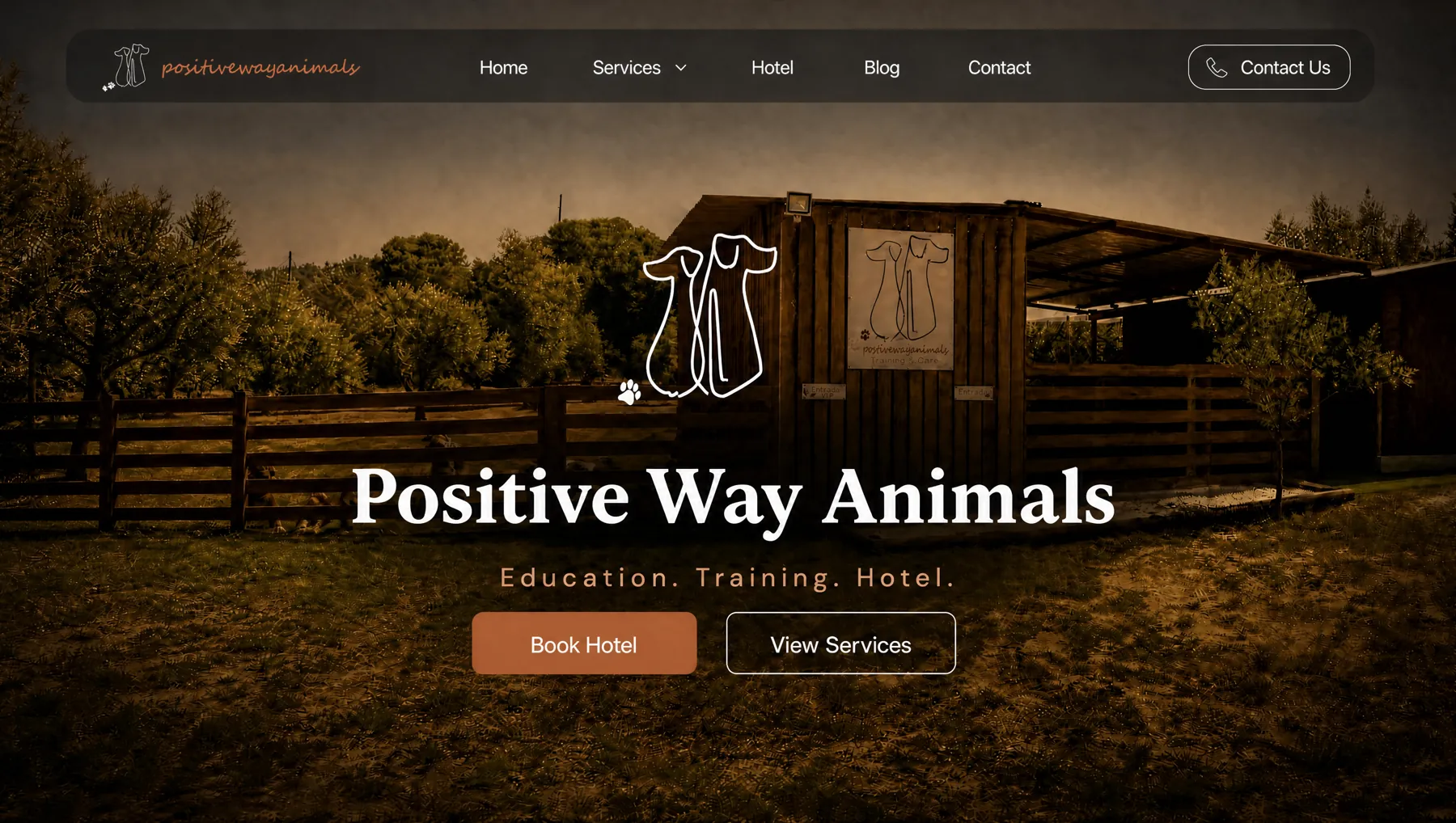
Positive Way Animals, my concept redesign of the place that trained two of my three dogs. See the concept →
None of it is loud, and that's on purpose. Good design for this niche should feel like walking into somewhere clearly warm and clearly capable, where you know, before anyone says a word, that your dog will be fine here. I know that feeling well. Octávio gave it to me. 🐾